Supercharged Petrolink’s Design Workflow
Jan 1, 2025
Petrolink
From chaotic feedback loops to a collaborative system, we delivered faster iterations, and clearer communication.
Introduction
At Petrolink, a tech company focused on innovative solutions, the design process was a bottleneck when I joined the team. Designers struggled with inefficient tools, inconsistent standards, and misaligned collaboration with developers. The workflow felt like running a marathon in flip-flops—doable, but far from optimal. This case study details how we overhauled the design process, leveraging modern tools and systems to achieve efficiency, consistency, and team harmony.
Challenges
The design team faced several critical issues that hindered productivity and quality:
Cumbersome Tools
UI kits in Sketch were massive, often exceeding 500MB, leading to slow loading times and frequent crashes, especially during client demos.
Duplicating these files for new projects was time-consuming and error-prone, disrupting workflows.
Inconsistent Design Standards
Designers used their own preferred styles, resulting in variations in colors (e.g., “Petrolink Blue” vs. “Steve’s Blue”), typography, and spacing.
This lack of standardization led to inconsistent user interfaces and confusion across projects.
Inefficient Designer-Developer Collaboration
Vague design specifications forced developers to rebuild components from scratch, wasting time and resources.
The lack of a shared language between teams created a cycle of rework and frustration.
Solutions
To address these challenges, we implemented a phased approach, leveraging modern design tools and best practices to create a streamlined, collaborative workflow.
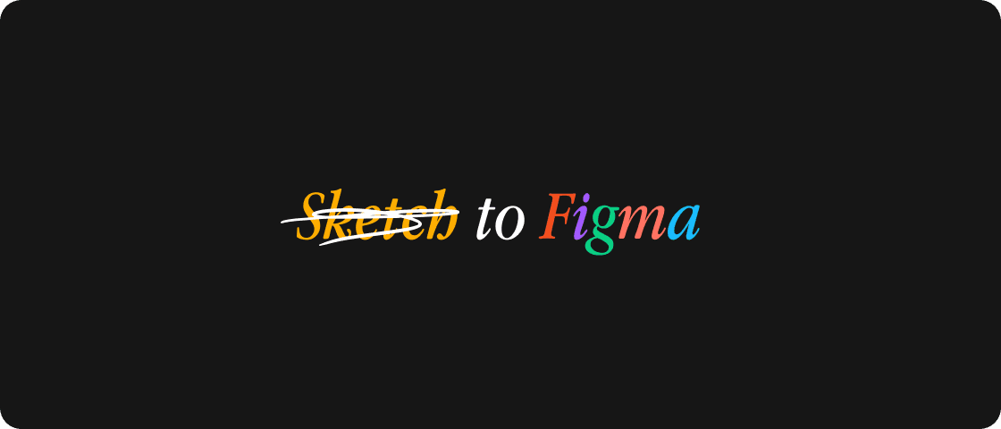
Phase 1: Transition to Figma
Recognizing that Sketch was a major bottleneck, we migrated to Figma, a cloud-based design tool praised for its speed and collaboration features. We organized legacy files into smaller, manageable project libraries, enabling real-time co-editing and automated version control. This eliminated conflicts and crashes, restoring team sanity.
Phase 2: Standardizing Design with Tokens
To ensure consistency, we introduced design tokens—a single source of truth for colors, typography, and spacing. Using Figma’s auto-layout, we built flexible components like buttons and grids that adapted to various contexts. This shift allowed designers to focus on user problems rather than debating margins or hex codes.
Phase 3: Dynamic Components with Variables
To handle complex scenarios like multilingual support, we adopted Figma variables, enabling dynamic settings for spacing, themes, and content density. Nested auto-layout components became adaptable “chameleons,” supporting diverse use cases with minimal manual adjustments.
Phase 4: Building a Pattern Library
To eliminate redundant work, we created a searchable pattern library for common UI flows, such as “Data Table with Filters” or “Wizard Forms.” Each pattern included clear usage notes to guide designers, ensuring consistency and speeding up project setup.
Phase 5: Developing a Comprehensive Design System
The culmination of our efforts was a full design system, connecting designers and developers through a shared language. We documented guidelines in plain English, used Storybook to sync Figma components with code, and conducted workshops to train teams. This system empowered everyone to work efficiently and cohesively.
Results
The transformation yielded significant improvements, validated by measurable outcomes:
Metric | Outcome |
|---|---|
Project Delivery Time | Reduced by 40% (from 6 to 3.5 weeks) |
Rework Reduction | Decreased by 70% |
Team Satisfaction | Improved focus on strategy and collaboration |
Faster Delivery: Projects that once took six weeks were completed in just 3.5 weeks, thanks to reusable components and streamlined workflows.
Less Rework: Developers no longer rebuilt components from scratch, freeing them to focus on new features.
Happier Teams: Designers shifted to strategic problem-solving, while clear specs improved developer collaboration, boosting overall morale.
Lessons Learned
Our journey taught us valuable lessons that shaped our approach:
Start Small, Scale Gradually: Addressing the biggest pain point (Sketch’s inefficiencies) first built momentum for larger changes.
Involve Developers Early: Early developer feedback on variables and components prevented costly rework.
Document Clearly: Writing documentation as if explaining to a beginner ensured clarity and accessibility for all team members.
Future Plans
To maintain and enhance our design system, we’re pursuing:
Automation: Integrating Style Dictionary to sync design tokens with code, eliminating manual updates.
Interactive Documentation: Developing clickable docs for real-time component tweaking and guideline updates.
Ongoing Maintenance: Conducting quarterly “Design System Health Checks” to prune outdated patterns and incorporate new ones.
Conclusion
By adopting Figma, standardizing design practices, and building a robust design system, we transformed Petrolink’s chaotic design process into a model of efficiency and collaboration. This case study showcases the power of modern tools and thoughtful systems to drive productivity, reduce rework, and empower teams to focus on what matters most—delivering exceptional user experiences.